
For decades, fall weddings have followed a familiar color formula: burgundy bridesmaid dresses, emerald green accents, navy suits, copper-toned florals, and rich plum details. These colors remain popular for a reason — they photograph beautifully against changing foliage, historic estates, vineyard landscapes, and candlelit receptions.
But there is one challenge with traditional autumn palettes: in certain venues, especially California gardens, vineyards, and outdoor estates, deep colors can sometimes compete with the natural surroundings rather than complement them. A landscape already filled with golden grasses, olive trees, warm stone, and late-season sunlight does not always need another layer of visual heaviness.
This is why more modern couples are exploring a different interpretation of fall wedding design: autumn pastels.
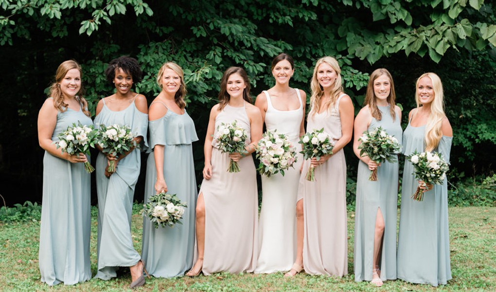
Fall pastels are not the same as the light, airy colors typically associated with spring weddings. The difference lies in the undertone. Instead of icy blues, bright pinks, or fresh mint greens, today’s fall pastel palettes use muted shades, dusty finishes, and warmer bases that naturally connect with the season.
Think of a peach tone influenced by October sunlight, a sage green that mirrors olive groves, or a soft lavender that feels closer to autumn twilight than spring blossoms.
The goal is not to make a fall wedding look like spring. The goal is to create a softer version of autumn — one that feels intentional, seasonal, and personal.
What Makes a Pastel Color Work for an Autumn Wedding?
A successful fall pastel wedding is not created by simply choosing lighter colors. The palette needs structure.
As a wedding planner, I look at three elements when designing with pastels for October and November celebrations: undertone, texture, and contrast.
1. Choose Warm or Dusty Undertones
The biggest mistake couples make with fall pastels is choosing colors that are too clean or cool.
Ice blue, baby pink, and bright mint may look beautiful in a spring garden, but under the golden light of autumn, they can feel disconnected from the environment. Fall pastels work because they share the same visual language as the season: softened sunlight, dried grasses, warm foliage, and natural textures.
A dusty peach with subtle orange undertones reflects the warmth of October’s low-angle sunlight. A sage green with a gray base works almost like a neutral against olive branches, vineyard leaves, and stone architecture. A muted lavender feels more like evening light than spring flowers.
For brides looking for a professional color reference, shades similar to Pantone’s Peach Nectar (15-1520), Green Milieu (15-0318), or Banana Cream (12-0720) provide a useful starting point — but the final result should always be adjusted based on the venue’s natural colors and lighting.
2. Add Seasonal Weight Through Texture
Color alone does not create a seasonal feeling. Texture does.
A pastel bridesmaid dress in lightweight chiffon can easily read as a summer destination wedding look. The same shade in silk charmeuse, matte crepe, velvet accents, or structured satin immediately feels more appropriate for an October celebration.
For bridesmaid fashion, fabrics with a heavier drape help soft colors feel grounded. A dusty peach silk gown or a sage green matte crepe dress will photograph differently from a thin chiffon style, especially during outdoor ceremonies where temperatures may drop after sunset.
The same principle applies to the reception design. Raw slubbed linen, stoneware plates, velvet ribbon details, handmade cotton paper, and brushed metal accents add the tactile depth that pastel palettes need in autumn.
3. Create a Dark Anchor
Soft colors need contrast.
A common mistake with pastel wedding palettes is creating a design that feels too light from top to bottom. Fall weddings benefit from a small percentage of deeper elements that create visual balance.
A successful autumn pastel palette often includes around 5–10% darker accents, such as:
- espresso-toned wood
- antique brass
- smoked glass
- charcoal stationery
- dark brown branches
- black flatware
These details do not overpower the softness of the palette. Instead, they make the lighter colors appear more sophisticated and intentional.
Four Fall Pastel Wedding Palettes for the Modern Bride
1. Dusty Peach & Muted Sage
A California Garden Wedding Favorite
Dusty peach and muted sage are among the most versatile fall pastel combinations, especially for California weddings.
The color logic is simple: dusty peach carries warm orange and pink undertones that echo golden-hour light, while sage green introduces a natural, earthy balance. Together, they feel perfectly suited for post-harvest vineyards, olive groves, and garden estates in October.
Floral Design
Instead of using bright peach flowers, focus on varieties with softer, more complex tones.
A strong floral recipe includes:
Primary blooms:
- Café au Lait Dahlias — known for their champagne, peach, and blush variations
- Distant Drums Roses — naturally transitioning between dusty peach and muted plum tones
- Buttercream Ranunculus — adding softness without making the palette feel too sweet
Supporting textures:
- Quicksand Roses
- Italian Ruscus
- Dried Agrostis grass
- Bleached walnut branches
Avoid using too much bright green eucalyptus or overly fresh greenery, which can push the palette toward a spring aesthetic.
Fashion & Styling
For bridesmaids, dusty peach works best in fabrics with movement and weight. A silk charmeuse bias-cut gown or matte crepe dress will make the color feel appropriate for an outdoor ceremony around 60–70°F.
For the reception, pair the palette with unbleached linen, brass candleholders, and warm ivory taper candles.
2. Dusty Lavender & Warm Honey
A Modern Alternative to Plum
Plum has always been a classic fall wedding color, but dusty lavender offers a lighter interpretation of the same romantic mood.
The difference is that lavender introduces softness without losing sophistication. When paired with amber glass, antique gold, and warm honey tones, it becomes ideal for evening receptions.
Floral Design
Recommended flowers include:
- Koko Loko Roses — famous for their unusual coffee, mauve, and lavender tones
- Butterfly Ranunculus
- Sweet Pea in muted purple varieties
- Dried lavender stems
- Chocolate Cosmos for darker contrast
The addition of deeper botanical elements prevents the palette from feeling too delicate.
Tablescape Direction
This palette works beautifully with:
- amber goblets
- antique brass candleholders
- lavender linen napkins
- handmade deckled-edge stationery
Under candlelight, dusty lavender becomes richer and warmer, making it particularly suitable for black-tie weddings.
3. Butter Yellow & Unbleached Linen
A Softer Take on Autumn Sunshine
Yellow has always belonged to fall weddings, but modern couples are moving away from bright golds and orange tones. Instead, butter yellow offers a more subtle interpretation.
This shade resembles warm sunlight rather than a bold statement color. It works especially well for California vineyards, farm estates, and outdoor celebrations where the landscape already provides natural autumn tones.
Floral Design
Consider combining:
- Yellow Garden Roses
- Toffee Roses
- Buttercream Ranunculus
- Chocolate Cosmos
- Dried Wheat
- Golden Amaranthus
The addition of darker botanical elements, especially chocolate cosmos, creates contrast and prevents the palette from becoming overly sweet.
Styling Direction
Pair butter yellow with:
- unbleached linen
- raw canvas textures
- warm ivory paper
- natural wood details
This palette feels especially appropriate for post-harvest vineyard weddings, where the environment already carries shades of gold, beige, and brown.
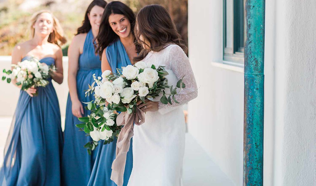
4. Dusty Slate Blue & Oatmeal
A Softer Alternative to Navy
Navy has long been a favorite for formal weddings, especially black-tie celebrations. Dusty slate blue offers the same sense of elegance while creating a lighter and more modern visual experience.
Unlike traditional navy, slate blue works beautifully with outdoor environments because it does not compete with the landscape.
Floral Design
Recommended botanical elements:
- Blue Thistle
- Dusty Miller
- Privet Berries
- White Quicksand Roses
- Soft gray foliage
These flowers bring subtle blue and silver tones without making the design feel wintery.
Fashion & Styling
For bridesmaids, dusty blue silk or chiffon gowns create a sophisticated silhouette. Pair them with oatmeal or light gray menswear for a cohesive wedding party palette.
This combination works especially well for:
- coastal California weddings
- mountain venues
- formal garden receptions
The Three Mistakes to Avoid With Fall Pastels
Mistake 1: Choosing Colors With the Wrong Undertone
Not every pastel belongs in autumn.
Cool pastels such as icy blue, baby pink, and bright mint can look disconnected against fall landscapes. Always test colors in the actual venue lighting before finalizing the palette.
A color that looks beautiful on a digital mood board may appear completely different under afternoon sun or evening candlelight.
Mistake 2: Using Summer Fabrics With Fall Colors
A pastel color does not automatically become autumnal.
A peach chiffon dress may still feel like a beach wedding. A peach silk gown feels completely different.
For fall weddings, consider fabrics that provide visual weight:
- silk charmeuse
- matte crepe
- velvet ribbons
- textured jacquard
- raw linen
Mistake 3: Forgetting Contrast
Pastel weddings need grounding elements.
Without darker accents, the design can feel more like a spring bridal shower than an October celebration.
Use small amounts of:
- antique brass
- espresso wood
- smoked glass
- charcoal stationery
- dark floral branches
These details create depth while allowing the pastel palette to remain the focus.
A New Way to Think About Fall Wedding Colors
The most memorable autumn weddings are not the ones that follow a traditional color formula. They are the ones that understand why certain colors belong in a season.
Fall pastels work because they are not trying to replace autumn’s classic colors. They reinterpret them.
By choosing warmer undertones, incorporating seasonal botanicals, selecting fabrics with dimension, and balancing softness with contrast, couples can create a wedding palette that feels unmistakably October — without relying on burgundy or emerald.
Autumn has always been about transformation. The modern fall wedding simply reflects that idea through color.